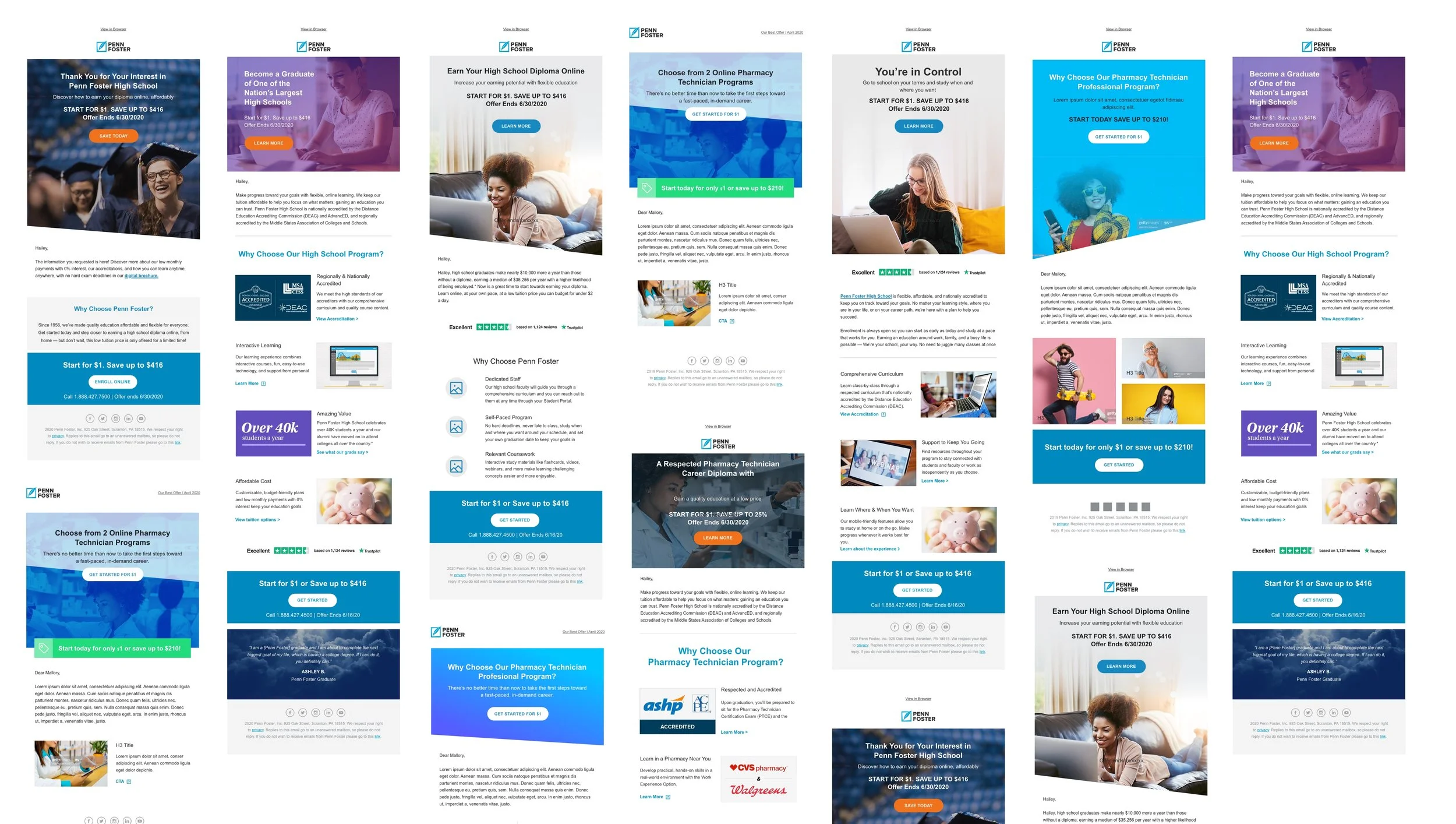
Building a responsive and scalable design system for email
Sector: Education, E-learning, Higher Education
Challenge: The organization had acquired eight new schools, each with unique branding, technology requirements, and various levels of email campaign maturity. The existing email templates were static and not optimized for mobile or accessibility. Consistency was difficult to maintain between campaigns and turn-around times were slow.
My Role: art direction, strategy, workshop facilitation, UX Design, UI design
Collaborators: Michael Brennan - UI design, Talia Cuccia - email development
workshop 1Intake Workshop
I facilitated a one-hour workshop with the Lifecycle Marketing team to identify challenges, technical requirements, business goals, deliverables, and timelines.
Challenges: Inconsistent design, static template layouts, not responsive, often broken, time-consuming to update and build ( 10 business day turn around )
Requirements: Responsive, flexible layouts ( component-based, not template-based ) themeable ( ability to swap out brand colors, logos, and fonts for each sub-brand ) modern design.
Technical Requirements: To be built in Acoustic.
Business Goals: Increase lead conversion, optimize lead nurture series for Penn Foster, and build new campaigns for sub-brands. Increase production speed. Reduce dependency on email development contractors.
Solution: A design system of interchangeable components they could mix and match to create unique email templates designed with tokens for custom branding.
Deliverables: Component library built in Adobe XD with specific components to be identified in a future workshop. A visual style guide for each brand consisting of colors, fonts, icons & button styles.
Using Miro to audit the existing email templates and brainstorm.
workshop 2Content Audit & Design Inspiration
The Lifecycle marketing team provided links and screenshots to their most commonly used email templates. We reviewed competitor emails templates inspiration from reallygoodemails.com. We used Google slides and Jamboard to lower the barrier to entry and allow everyone to share ideas. As a group, we identified common use cases and content types.
Templates: Lead Nurture Multi-touch Series, Offer Emails, Payment confirmations, Refer-a-friend, Event Announcements
Component Needs: header, footer, hero, offer/savings, Trustpilot review, body copy, contact/support, multi-column content, lists, benefits, s-curve right & left, image full width, various gallery layouts, video, offer bar, recovery, special savings testimonial, with and without image.
Design Inspiration: AirBnB, Framer, Google Nest, Lending Tree, Vacasa, Canva
Gathering inspiration from reallygoodemails.com
designStyle guide & component library
Using existing brand guidelines I created simple style guides for each of the brands which included spacing, color palette fonts, typography scale, primary & secondary button styles & skrim gradients for image overlays. I added these styles to brand-specific XD libraries. The style guides were handed off to the email developer.
I sketched out simple component layouts to inform my wires and started layout them out using my established style libraries on a 640px wide artboard for desktop & 320px for mobile.
Email style guides for Ashworth College, James Madison High School, NYIAD & NYICD.
Sample of email components.
Lead nurture series built using email design system components and the brand style guide.
documentationDesign system documentation and development
I established a naming convention for my components and created a simple documentation guide in Google docs which included use cases and character limits for headlines, body copy and, CTAs. Each week I handed off completed XD components and documentation to our email developer for buildout. We used comments in our Google doc to ask questions and collaborate. As components were built a visual QA was completed by me and the lifecycle team.
Documenting component names, usage guidelines and character limits for copy.
conclusionOutcomes & Learnings
This project was my first ever attempt at a design system. The constraints of email design allowed me to keep my styles simple yet flexible. The system scaled well across Penn Foster’s eight brands. Working with easily accessible tools like Google docs made it easy for me to collaborate with others on the project and introduce the concept of system design to the organization.
While I enjoyed the collaborative benefits of Google docs if I were to change anything it would be my documentation. Had I been aware of tools like zeroheight at the time I would have loved to build out a style guide, with assets downloads and detailed documentation. Luckily I was given that opportunity when I helped build Hinge, The Penn Foster Design System.


